Over at Shopify, the illustrators have been busy. We’ve been working hard to find a new visual voice for Shopify. (And of course when I say we I mean Ryan Coleman & Holly Schofield. Think I’m being humble or whatever? How to Build a New Illustration Style for Shopify? Ask a first-time design manager how much actual design they put out. Seriously. Zero heavy liftings here. Ryan and Holly are crazy talented.)
The Problem:
Why was it so important to give Shopify a new Illustration style?
An illustration is a communication tool with three superpowers. It can add clarity to a complex idea. It can link concepts to the words we’ve assigned them within our respective products (aka onboarding). And, it can capture the values and traits of a brand in a single voice, shift the tone depending on the situation, and speak directly to the user.
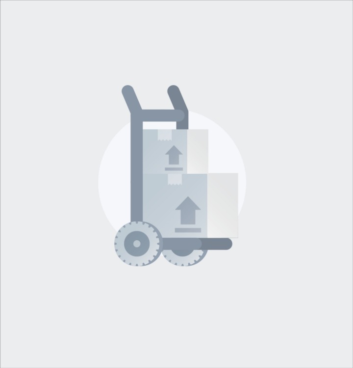
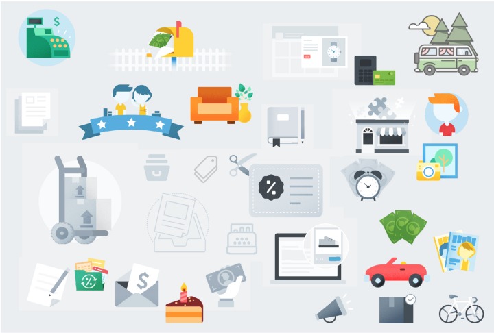
The existing illustration style, while visually pleasing, did little to augment the content, and only repeated the existing copy instead. It was limited in its ability to communicate complex ideas, and it did not accurately map to Shopify values or principles.
The Before:
The Process:
It’s really cool when people trust you with a blank canvas. It’s also really freakin’ hard, and mildly scary. When you’re making decisions at a large scale, the elephant in the room is always “How long do you think we’ll like this?”. Every decision feels major, as its weight is echoed in each subsequent decision. From what I can tell, you’re never 100% sure, if you’re making the right decision while you’re making it, but looking back it’s obvious when you were right (and when you weren’t, but let’s not dwell on that).
A good place to start is to set some goals. What are you trying to do with the update? How will you know when you’ve done it? We set the following goal for the new illustration style:
Create a unique and flexible illustration style that can evolve as Shopify grows—a visually appealing style that works across character, scene, spot, and icon illustrations. Illustrations should make the merchant feel confident in their tasks and inspired to do more. The illustrations should feel consistent, like they came from the same source—the same company, the same brand, the same voice, the same person (metaphorically, and literally look like they were illustrated by one person)—while still smoothly changing tone, depending on the audience, their task, and emotional state.
And defined success as when we have clearly articulated and documented the following:
– Colour palette complimentary but distinct from the UI
– Clear guidelines for how a scene, spot, character, and icon are designed
– UI kit update
(I’ll add that we had also included the execution and rollout of updating all the existing illustrations—but in retrospect, I think the above are the mark successfully of finding a new illustration style, the rest is follow-through)
Okay. Cool. We know what we want, I guess all that’s left is to do it…
We were lucky enough to have a killer content team, who created some great resources about values, voice, and tone that we could already map to. It’s never going to be a direct translation going from words to illustrations. You can’t exactly say why any given illustration—say, of a cat, or a chair, or a clock—is motivating. But it gives you some common language, and a starting point to have a conversation and a common goal.
I love using this not that to talk about the qualities we’re aiming for. Using a spectrum instead of a single quality gives you that extra bit of wiggle room—you might not always be able to assert why something is approachable, but you can say with certainty it doesn’t feel oversimplified. Okay, cool. So you’re saying it’s on the spectrum, it has qualities we’re aiming at, let’s talk about it.
So, the Shopify voice is…
– Trustworthy, not inexperienced
– Confident, not boastful
– Empowering, not absent
– Inspirational, not unachievable
– Enthusiastic, not hyperbolic
– Big, not impersonal
– Genuine, not artificial
– Focused, not limited
– A partner, not a vendor
– Empathetic, not apologetic
– Tasteful, not clickbait
There’s still a lot of room for interpretation in those words. So how do we visually articulate our vision for the new style? You guessed it! Moodboard!
Everybody scours the internet. Find the things you like, and the things you definitely don’t (equally important). Put them on the wall. Let’s talk about it. Does that one capture one of the Shopify traits? Why? How?
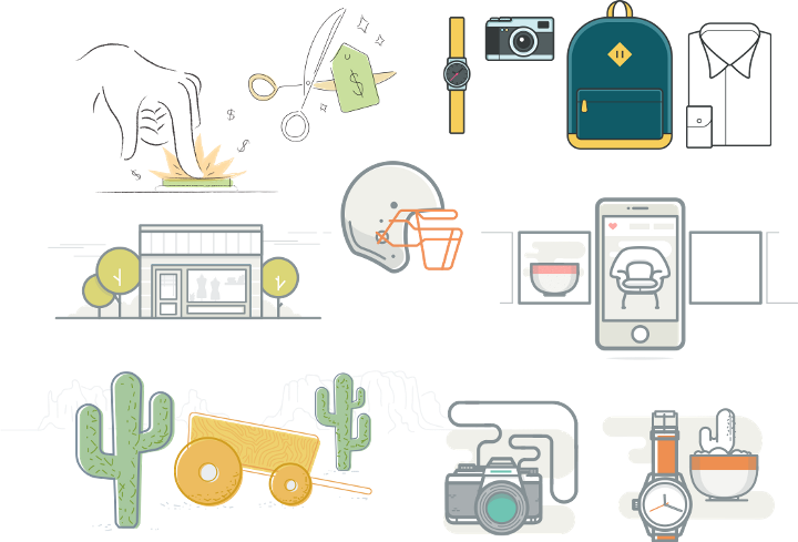
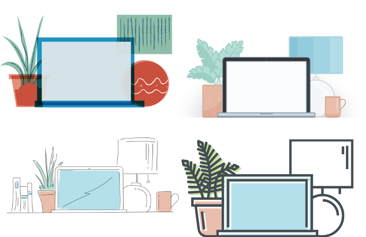
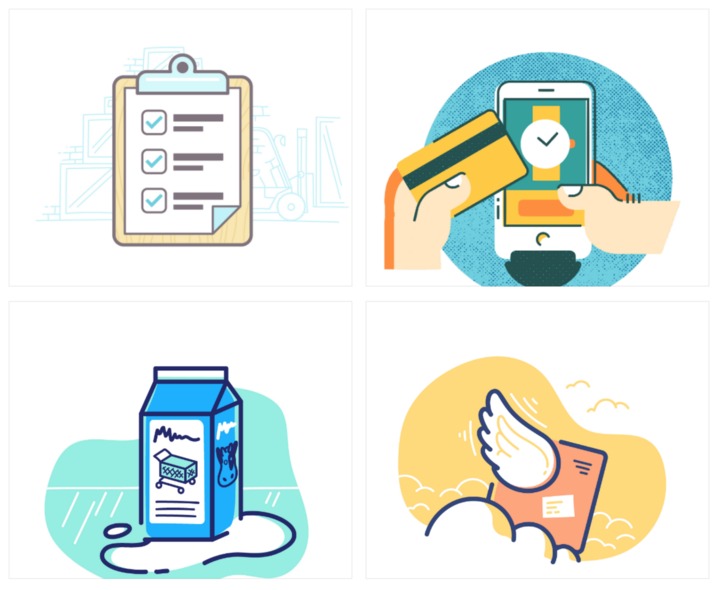
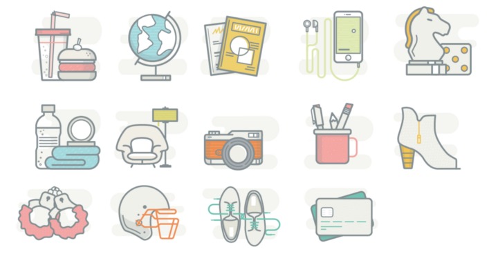
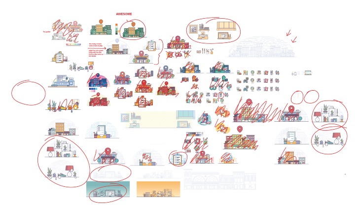
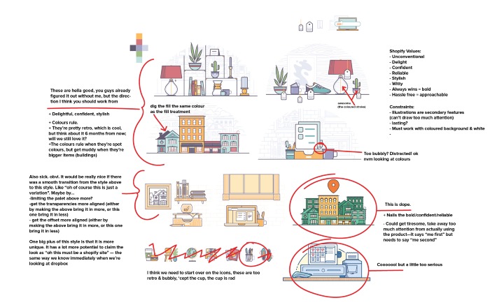
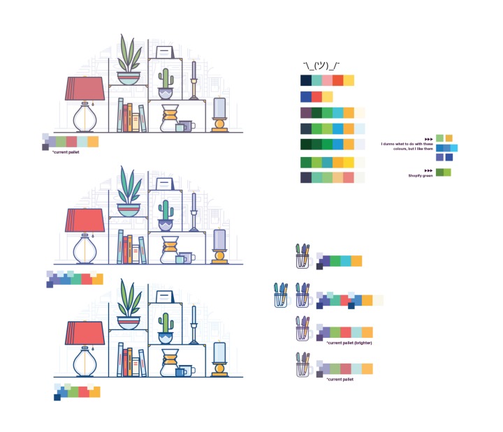
We had this beautiful vision of a perfectly defined problem, followed by a perfectly defined solution, followed by a smooth and seamless rollout. We were waiting patiently for the curtain drop moment on all our hard work.
Of course, that’s not how it works.
You can only make so many hypothetical decisions. At some point—sooner than later—you and your team need to sit down together and answer the following questions:
Do you think we have explored everything worth exploring?
Will you be happy if you’re drawing in this style?
Will you be proud of the work you make if we keep going down this path?
If you have a resounding YES, then you need to put any nagging feelings aside. Decide to move forward—on to the real problems you’re trying to solve—with confidence. This is the best decision direction available to you. Yes, there is a better solution out there. The returns on finding it are negligible compared to the value of launching now. At some point, you need to prioritize getting shit done.
The Documentation:
I’m pretty sure future Meghan is going to be stoked that we took the time to document our decisions. As the team evolves, I would consider it a failing on my part if there is no means for the next person to step in and easily get up to speed. There is no doubt that it is a useful tool for sharing what we’ve created, someday. To be honest, when there are three just three of us who invented this illustration style—who spend 110% of our time drawing in this illustration style, talking about this illustration style, and thinking about this illustration style—we don’t exactly need to refer back to the style guide on the reg.
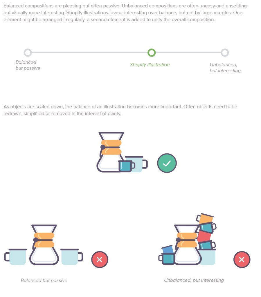
But where the style guide and documentation are powerful, particularly in the early stages of creating a new illustration style, is alignment. It starts with “Okay, I’m writing this down, we’re all on board with these colors, right?” — an easy check. Every time the style guide grows, the questions get a little bit harder, moving from “rounded or square caps?” to “Hey there’s something to the objects we choose to illustrate that makes them feel like they belong together. What is it?” or “So you know how we’re always a little haphazard, but, not too much..?”
Sometimes the decisions are retroactive, noticing a trend and capturing it. Other times someone is presented with a new problem and brings it up for discussion before moving forward. Both cases bring the illustration team back to the same starting point and help them move forward as a whole.
As it stands, we’ve documented the following:
– Common language & definitions (icon vs spot vs scene)
– Best practices (file naming/management/organization/setup)
– Principles
– Composition
– Qualities
– Colour (Do’s & Don’ts)
– Stroke
– Fill
– Shape
– Perspective
– Graphic Elements
– Background
– Consistency Batching (when the rules of consistency can be bent & when they can’t)
– Exporting
– Making a pull request (actually just a step-by-step so we don’t always need to ask for help)
Moving forward we’ll be solidifying how we handle characters, animation, icons,
The Execution:
It’s easy (relative term here) to put three people and come up with a new look. You can pull in a few stakeholders, try to be as transparent about what you’re doing, and get people excited about the end result, but on a product of this size, you just need to pick a starting point. When you’re working with a platform hosting over 200,000 users whose livelihood relies on your product, with a network of partners and sales channels that each have their own relationship with the visual identity of the product, there is a right and wrong answer about where to start.
It was a hard decision, but the first thing we did was decide that we were okay with a transition period. That is, a period where it was possible to have both illustration styles living on the product. Not ideal. But when the alternative is working by ourselves for some undefined amount of time preparing for the big reveal, instead of looking at our project as living and evolving, one that is an integral part of other projects, the decision was obvious.
The next hard decision was what direction to approach the update in. Should we go from the outside in? Starting at the points of least engagement, giving ourselves room to breathe and continue to evolve the new style, without being too jarring to the users who were using the product every day. Or should we go from the inside out? Starting at the points of highest engagement, updating the product with the best work we had available to us, and creating an opportunity to gather the most feedback and inform the new style.
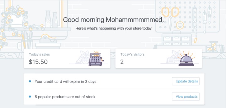
To be perfectly honest, we flip-flopped a little on how to start. We started with the former, not wanting to be too disruptive to the users currently using the product. Then changed our minds, and decided we wanted to roll it out on the main dashboard, resolving to deal with the edge cases as they came. At the time it felt like we were making up as we went along (we were, but it doesn’t usually feel that way), and was admittedly discouraging. But looking back, it—like baby bear porridge—turned out just right.
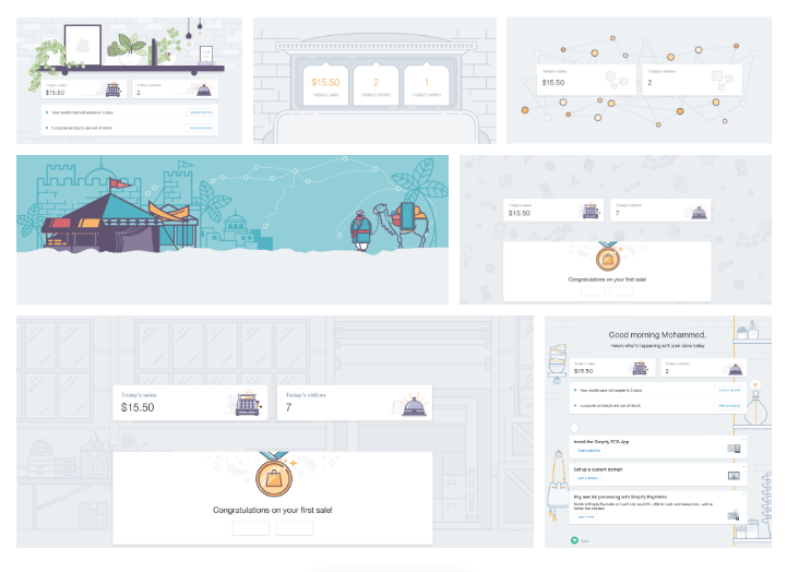
Starting with some empty states and a few edge cases gave us the opportunity to refine our decisions in real-time, and revisit some of the elements we were handling differently so that we could move forward together as a team, without dragging another team into it.
and probably some other things.
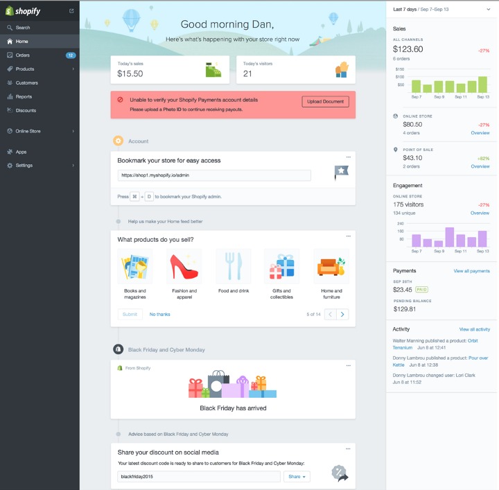
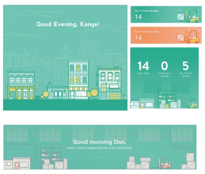
Okay. Cool. Armed with a better sense of what the new illustration style looks like in practice, we could bring another team into it, and start to redesign home.
Or if for some reason you have the biggest screen known to man… we’re ready for you.
For the love of process, some unused directions for you…
We’ve shipped the updates to the home. We could sign off and move on to updating the next aspect of Shopify—god knows there’s enough of it. But I think the lesson here, the thing I’m ready to assert as the best way to execute an illustration-style update, is to leave the issue open (metaphorically speaking). Embed yourself on the other teams—one at a time. Make it clear that you’re not a service, but rather a powerful resource. A team of designers who think critically about when illustration is the best tool for the job (and who are equally prepared to say so when it’s not).
What’s next:
We’ll continue to evolve the style, integrate with other teams, and document the Shopify Illustration Style, confident in both having found a voice and appropriate tone for the Shopify product.
Our next project is to adapt the new illustration style to reflect the tone of the other branches of Shopify (branding, marketing, culture, video, etc). Find a unique voice that is definitively Shopify, and translate it into a variety of distinct, but similar styles that complement both each other and the context they’re presented in, ultimately facilitating a cohesive, memorable, and empowering experience.
If you enjoyed this, you might also enjoy these post
