Shopify is one of the biggest e-commerce platforms on the market and hosts many stores. If you have a Shopify store, you will know that creating forms is crucial. That’s why we gathered Shopify form examples in this blog post. By looking at these top 17 Shopify form examples, you can come up with a form for your store.
Forms on Shopify stores can be used for a variety of purposes. Whether you want to collect emails or sell your products, forms are essential parts of Shopify stores.
That’s why we gathered Shopify form examples in this blog post. By looking at these top 17 Shopify form examples, you can come up with a form for your store.
No matter what your goals are, explore these examples and start building your unique and attractive Shopify forms now!
Contents:
- 17 Best Shopify Form Examples for Inspiration
-
-
-
-
-
-
-
-
-
-
- Vital Proteins’ Discount Popup Form
- Culture Kings’ Giveaway Popup Form
- Pip corn’s Contact Form
- Fashion Nova’s Discount Popup Form
- White Fox Boutique’s Request Form
- Artisaire’s Contact Form
- Luvo’s Free Gift Form
- The Sill’s Discount Popup Form
- Jeffree Star Cosmetics’ Descriptive Form
- The Brick’s Valued Feedback Form
- Timbuk2’s Contact Form
- Rebecca Minkoff’s Contact Form
- Nativecos’ Feedback Form
- Unif’s Contact Form
- Aloyoga’s Email Newsletter Form
- Untuckit Feedback & Contact Form
- Bombas’ Contact Form
-
-
-
-
-
-
-
-
-
- Tips to Consider to Create Shopify Forms That Users Will Complete
- In Conclusion
- FAQ
17 Best Shopify Form Examples for Inspiration
Using forms on your Shopify store can make your customer service experience better. You can gather your visitors’ requests and struggles they encounter with forms quickly.
In addition, collecting feedback and getting in touch with visitors becomes much easier with Shopify forms.
We listed 17 best Shopify form examples so that you can get inspiration! You can build your Shopify store’s forms quickly by delving into these form examples.
1. Vital Proteins’ Discount Popup Form
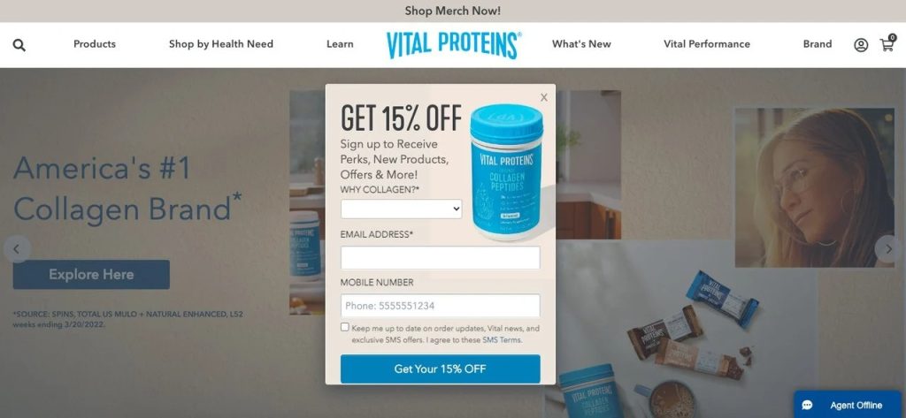
Vital Proteins uses a popup form on their homepage and offers a discount. With the headline “Get 15% off”, this popup is excellent for increasing conversion rates. In addition, the brand includes a product image on the popup and explains what kind of content they offer.
The description includes trigger words such as “new” and “more,” which can lead people to take action. Then, the brand asks the question “Why collagen?” to collect feedback from their visitors with this form.
Email and mobile number inputs are great for gathering customer data and increasing conversion and user interaction.
Vital Proteins’ popup form ends with a clear CTA that says “Get your 15% OFF” and encourages people to sign up for their website.
2. Culture Kings’ Giveaway Popup Form
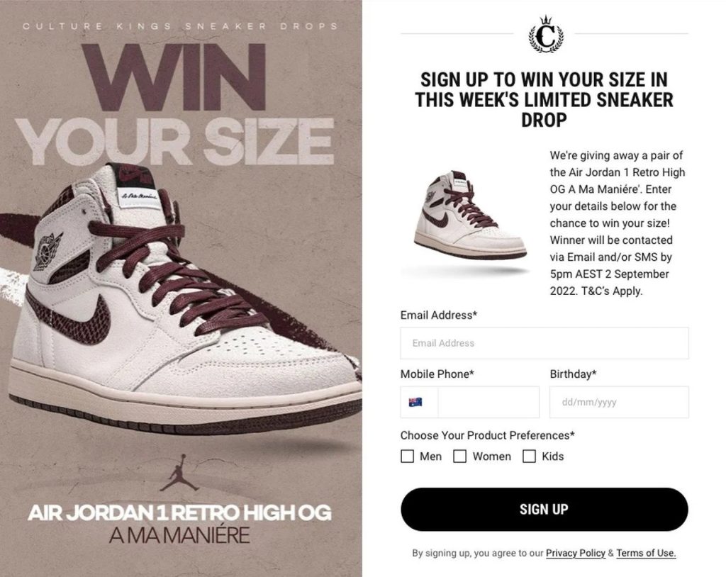
Culture Kings announces its giveaway with this popup form effectively. They included a product image on the left side with the headline “Win your size” and the product name. In the form section, the headline contains a word that creates a sense of urgency: “limited.”
The brand also includes its name and logo in the popup form and uses consistent fonts and colors that fit its brand’s style.
After grabbing visitors’ attention, Culture Kings clearly explains their giveaway email campaign’s details with another product image. Email address, mobile phone, and birthday inputs are added toward the end. The form section of this Shopify form is short yet clear and serves the needs.
Also, the “choose your product preferences” part is added towards the end to send personalized emails and products to people who sign up.
3. Pipcorn’s Contact Form
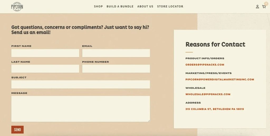
Pipcorn’s contact page includes a form and reasons for contact. The headline “Got questions, concerns, or compliments? Just want to say hi? Send us an email!” is an excellent example of a conversational and sincere copy.
The brand starts its contact page by showing that they appreciate concerns, compliments, and feedback from its visitors. Then, contact information inputs are added along with subject and message sections.
It’s a great Shopify form example that allows visitors to interact with the brand about their questions and feedback.
Overall, the contact form page looks consistent with Pipcorn’s whole website, and a well-written copy indicates that visitors are welcome to get in touch with the brand.
4. Fashion Nova’s Discount Popup Form
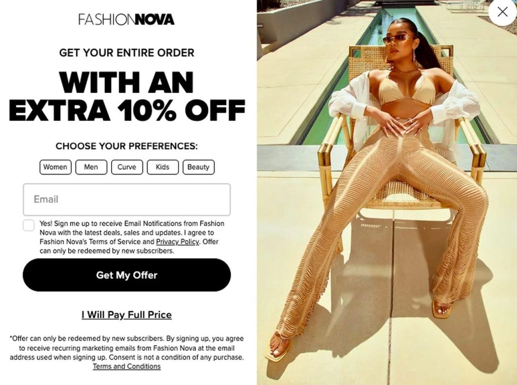
Fashion Nova’s popup form offers its visitors 10% off if they sign up for their email newsletter. This Shopify form begins with the headline “Get your entire order with an extra 10% off,” which is a converting and eye-catching copy.
Then, choose your preferences, and the part includes women, men, curve, kids, and beauty so that visitors can personalize their newsletter experience. By including this option on their popup form, Fashion Nova shows that they have a wide range of products in their collections.
After the email input, privacy policies and terms of services are added as well. “Get my offer” and “I will pay full price” buttons are great CTA examples that can tempt people to fill out a newsletter form.
Also, a high-quality image with the brand’s products is included in the popup form; thanks to that, the brand promotes its products.
5. White Fox Boutique’s Request Form
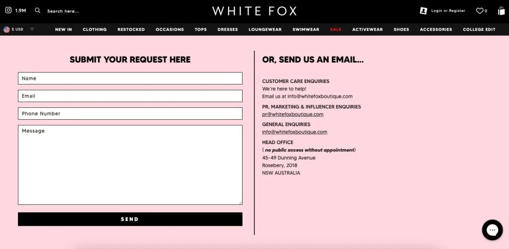
White Fox Boutique adds a request form to their Shopify store so customers can share their feedback and ideas. The contact form starts with a simple “Submit your request here,” and contact information and message inputs are added.
Although the form is well-designed and comprehensive, they also give an option for their visitors to send them an email. By adding these two options to their request page, White Fox aims to collect form submissions and gather emails from their visitors.
This Shopify form’s style goes hand in hand with the website’s design and colors, making it more fillable.
6. Artisaire’s Contact Form
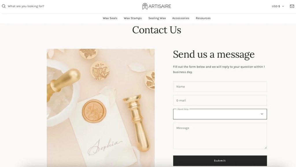
Artisaire’s minimal yet effective contact us page is an excellent example of collecting feedback and interacting with customers. This contact page includes an aesthetically pleasing product image with a form section.
The form part starts with a simple “Send us a message” headline and the description indicates that the brand replies to questions within one business day.
This contact page and form don’t overwhelm visitors with so many questions; it simply allows them to share what they have in mind and contact the brand.
7. Luvo’s Free Gift Form
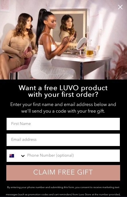
Luvo starts with an attention-grabbing headline that says, “Want a free LUVO product with your first order?” which includes the effective word “free.” This popup form contains people who are using the brand’s products at the beginning to increase the effectiveness of the form.
Then, the process of gaining a free gift is explained in the description part. The form includes name, email address, and phone number inputs so that people can enter their contact details.
In the end, the “Claim free gift” button is added, which is an example of a clear CTA button.
8. The Sill’s Discount Popup Form
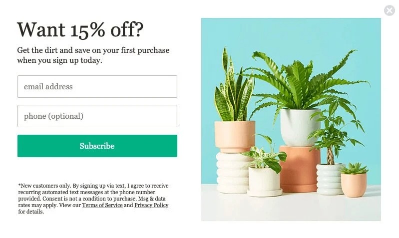
The Sill chooses to use a minimal yet impressive popup form to reach its target audience. The headline “Want 15% off?” is an excellent call to action since most people love to get a discount while shopping.
The description part starts with a wordplay “get the dirt,” and it is an excellent pun since The Sill is a company that sells plant and plant accessories. The company explains that visitors can get a discount on their first purchase if they sign up today.
The form includes two sections which are an email address and an optional phone number. The “subscribe” button is added at the end as well.
9. Jeffree Star Cosmetics’ Descriptive Form
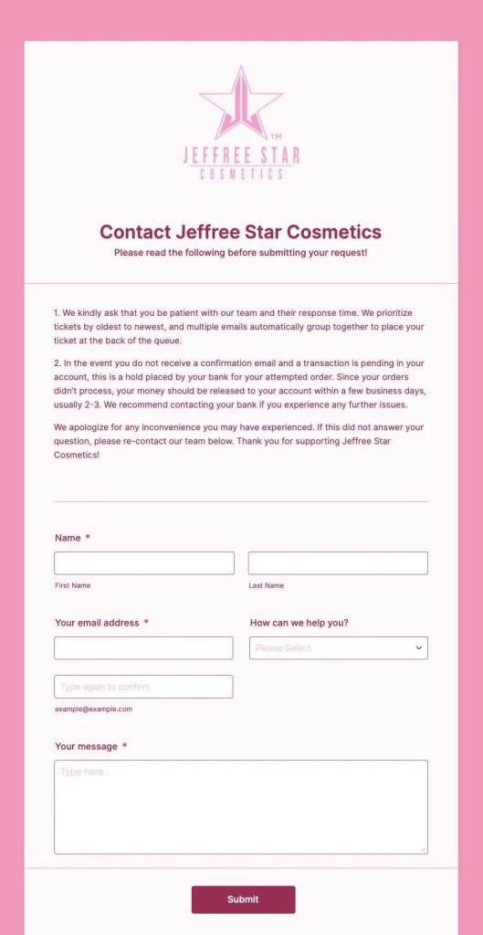
Jeffree Star Cosmetics’ contact form includes comprehensive details for those who want to fill out a form. It has a consistent style, considering the website itself is full of pink shades.
The contact form starts with the brand’s logo and gives information about response times and their policies on specific issues.
It might seem a bit overwhelming for visitors, but to explain essential details thoroughly, the company decided to add some quick info.
Then the contact form section is added with contact information and message inputs. Also, the “How can we help you” part that includes common questions is added. It can be helpful to categorize form submissions into different sections.
10. The Brick’s Valued Feedback Form
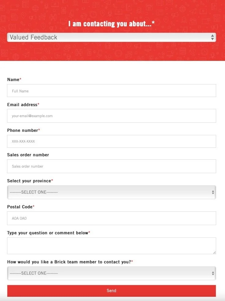
The Brick’s valued feedback form starts with the sentence “I am contacting you about…” and includes different options. Brand colors are used in this form template, and many inputs are added.
This Shopify feedback form includes necessary sections that can be needed in valued feedback. Overall, it’s a simple form that you can get inspired if you want to ask various questions to your visitors.
11. Timbuk2’s Contact Form
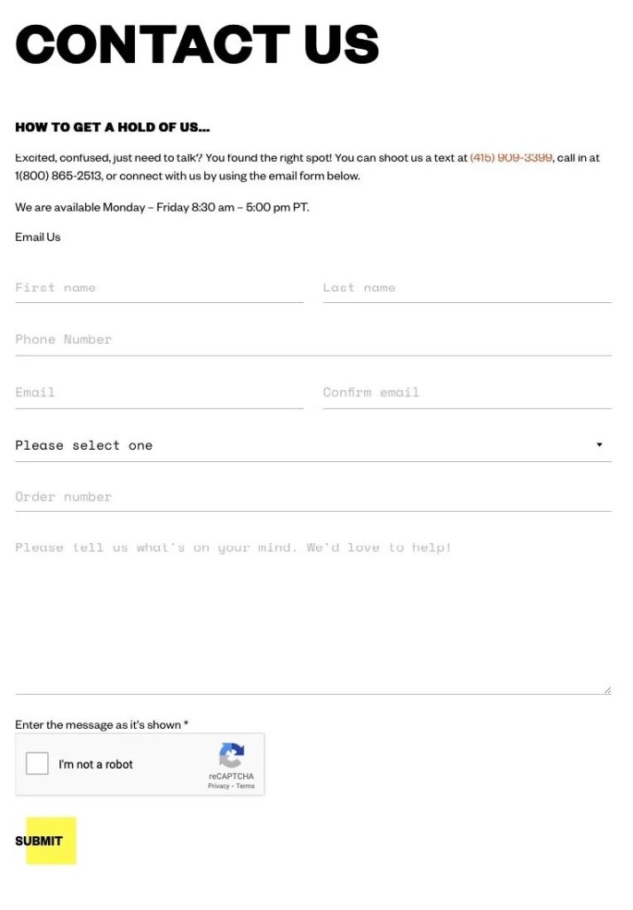
Timbuk2 ’s contact page starts with a classic “Contact us” headline and a sentence which is “How to get a hold of us…”. Then, the brand uses sincere and colloquial language in its description part. Contact information such as phone numbers and available dates are added afterward.
The form section of the company includes usual questions about contact information along with an “I’m not a robot” captcha.
Timbuk2’s contact form is a clear and straightforward Shopify form example that uses consistent brand fonts and colors.
12. Rebecca Minkoff’s Contact Form
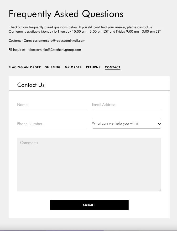
Rebecca Minkoff’s contact form page starts with frequently asked questions, which is a brilliant idea to prevent getting the same questions all over again. Also, the brand’s contact information is included at the beginning of the page.
By including the FAQ page in this section, the company indicates that if their visitors have similar questions, they can visit the FAQ page first. Then, different categories, which are placing an order, shipping, my order, returns, and contact, are included on this page.
The contact form of the brand is simple yet functional and goes hand in hand with the brand’s website.
13. Nativecos’ Feedback Form
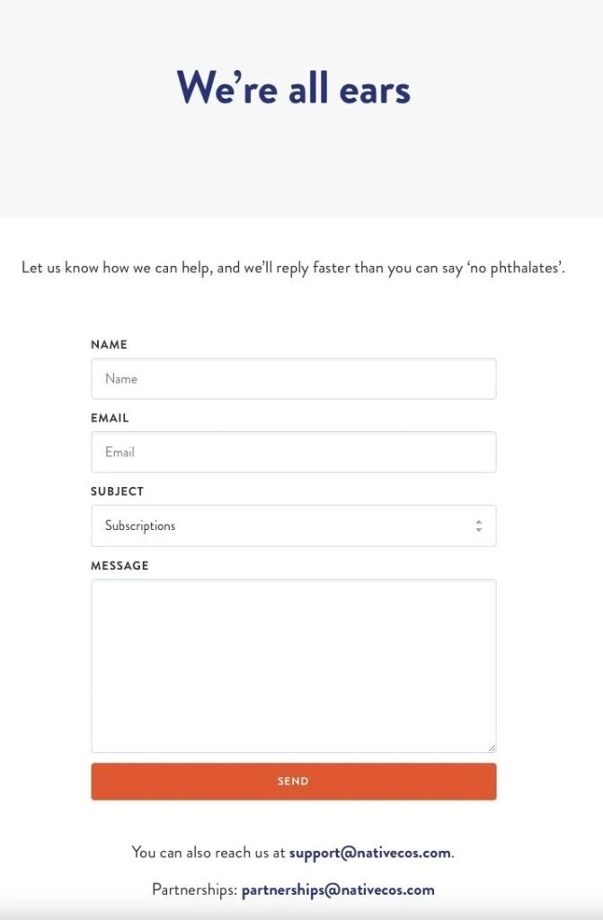
Nativecos starts its feedback form with the headline “We’re all ears,” which is a great way to show that they value feedback. The brand includes a description in the form that says, “Let us know how we can help, and we’ll reply faster than you can say ‘no phthalates’.”
Finally, Nativecos adds a witty copy on their feedback page using a wordplay related to their products.
The company’s feedback form shows they care about their visitors’ ideas and feedback. The form includes contact information, subject categories, and a message section.
Also, the brand’s contact information is added at the bottom of the form so that people can also send an email.
14. Unif’s Contact Form
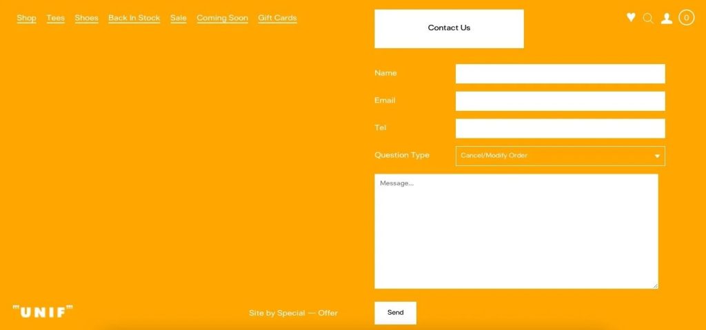
Unif’s contact page looks consistent with the brand’s whole website. The position of the contact form and the brand’s logo are similar to other pages. In addition, the contact form of Unif looks minimal, and the use of colors is aesthetically pleasing.
The form includes contact information, question types that relate to different issues, and a message section.
Question types of this contact form include “cancel/modify an order, order status, product info/question, account status, model inquiry, and hey, I’ve got a great idea.” The brand aims to answer customers’ questions and collect feedback with this contact form.
By categorizing the question types into different categories, the brand can deal with the forms properly without getting overwhelmed.
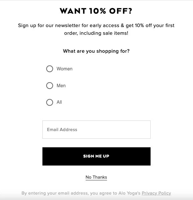
Aloyoga’s email newsletter popup form is an excellent example of collecting email addresses from visitors. It starts with the headline “Want 10% off?” and explains the benefits of the brand’s email newsletter.
This popup form asks a question: “what are you shopping for?” so that Aloyoga can send personalized emails to its email newsletter subscribers.
Asking a question on a popup form like this can be helpful since it increases user engagement. Also, you can get a better understanding of your target audience.
The popup form of Aloyoga ends with an email address input, a call to action button that says “sign me up,” and a “no thanks” button.
16. Untuckit Feedback & Contact Form
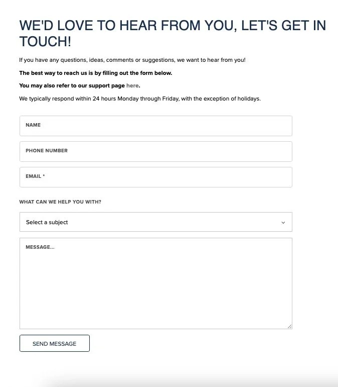
Untuckit starts its contact and feedback form with the headline “We’d love to hear from you, let’s get in touch!” The brand explains the contact form first and includes the support page.
Also, Unutckit adds the typical response times so that people can get an idea of when they’ll get an answer to their questions.
In the form section, standard contact information inputs are added along with selecting a subject and message parts. Finally, the form ends with a “send message” button.
It is a minimal contact and feedback form example that can be functional for each type of business.
17. Bombas’ Contact Form
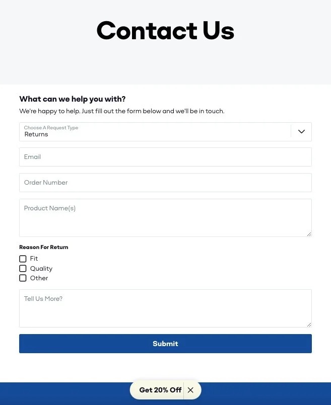
Bombas’ contact form is a classic contact form that includes to-the-point questions. The form starts with the headline “contact us” and a description part that says, “What can we help you with?” Also, the brand states they are happy to help and will be in touch once visitors fill out the form.
The form section starts with a “choose a request type” section with different options. Then, the contact details section is added with the order number and product names parts.
The reason for the return part is added with another style, and three different boxes which are fit, quality, and other are included. With the “tell us more?” input, the brand aims to get feedback in depth detail from their customers.
Below the submit button, the “Get 20% off” button is included at the end of this form. While collecting feedback and requests from its visitors, Bombas offers a discount to increase sales conversions.
Tips to Consider to Create Shopify Forms That Users Will Complete
Here we listed what to consider for having a Shopify form that users want to complete:
- Try not to add many questions; relevant and short questions are always better.
- Categorize your forms’ questions into different sections so people can add relevant information. Also, it can be helpful for you to evaluate your customer feedback and questions effectively later on.
- Give importance to your forms’ style. It should be consistent with your brand identity. Using the same colors and language can be great for your brand’s overall style.
- Adding popup forms is a great way to capture your visitors’ attention. By building popup forms with catchy headlines and descriptions, you can get your visitors to fill in your forms.
- You can grow your email list and reach more customers by using Shopify newsletter popups. Adding a simple popup form that collects email addresses can be useful for collecting customer data and increasing the mailing list.
In Conclusion
That’s all for Shopify form examples! We hope you liked exploring these 17 Shopify form examples of famous brands. By getting inspired, you can build your forms and gather contact data and feedback from your visitors.
Also, you can step up your customer service by using forms on your Shopify store. In terms of dealing with returns and changes, shipping issues, and product problems, adding relevant forms can make your job easier.
Contact forms are also great for getting in touch with your customers and interacting with them. In addition, you can make the most of your forms according to different use cases.
Popup forms make everything smoother since popups are a great way to get visitors’ attention. Adding newsletter popup forms, contact forms, and suitable ones for your use cases can be useful.
You can get started with a popup builder like Popupsmart to build popup forms for Shopify stores. That way, you can collect leads and increase your form conversion rate!
FAQ
Can You Create A Form in Shopify?
You can create a form in Shopify on your admin panel easily. Then, you can add a page by selecting the “Pages” section on the “Online Store” part. Your page can be named a contact page or whatever you want to call it. After that, you can finish your contact form quickly by adding texts and inputs.
What are The Form Builder Tools for Shopify?
You can use form builder tools if you wonder how to create a Shopify form. There are many form builders that you can use on your Shopify store. By using them, you can create eye-catching forms, and people can interact with them more.
The handiest tools that you can use to create Shopify forms are:
- Popupsmart
- Jotform
- Typeform
- Paperform
- Google Forms
- Contact Form Builder by Elfsight
- Contact Form by POWR.io
If you enjoyed this post, I’d be very grateful if you’d help it spread by emailing it to a friend or sharing it on Twitter or Facebook. Thank you!
