Since launching in 2009, the Shopify App Store has had more than 12 million app installs. It’s a critical place for business owners to find solutions for everything from sourcing products to marketing to fulfilling orders. But by 2017, the Shopify App Store was starting to show its age.
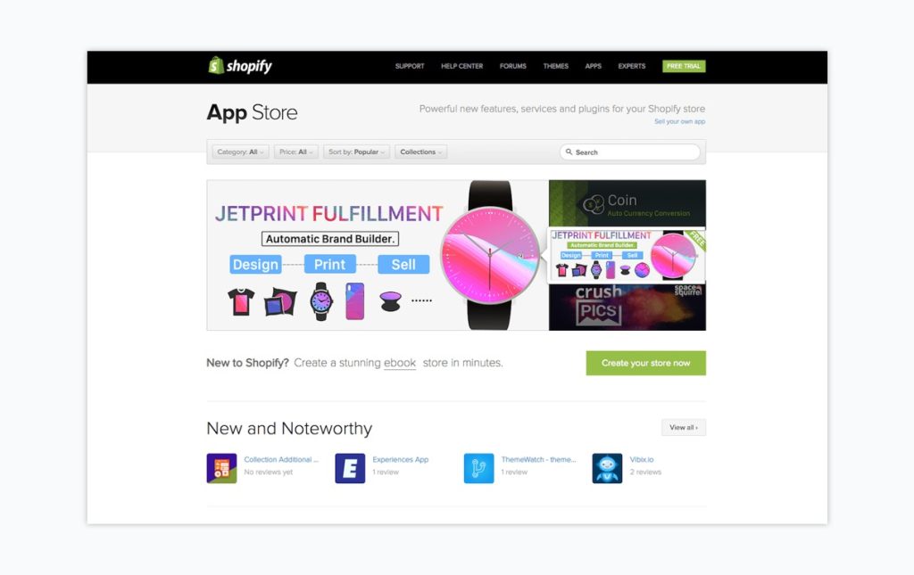
As the number of published apps grew from a few dozen to a few thousand, serious UX weaknesses became apparent:
App listing information was inconsistent, which made it difficult for users to figure out what an app did or what it cost. Users were unable to make an apples-to-apples comparison.
Apps were hard to find, because we only had 11 categories for over 2,000 apps and half of them were in a single catch-all category. Users had to wade through giant buckets of apps, so many of them preferred to turn to forums or other communities to get app recommendations rather than sort through the options on their own.
Luckily, our redesign goals were clear: help merchants find the right apps for their business.
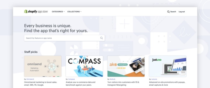
Doing so would also help our developer partners get their apps discovered by the right merchants and reduce the number of uninstalls (and potentially negative reviews) by merchants who didn’t understand the app’s purpose.
As is often the case, the goals were straightforward but the redesign wasn’t. Getting the content we needed to meet our project goals required an intricate collaboration between developer partners, content strategists, designers, researchers, and taxonomists. Here’s how we made it happen, and what we learned along the way.
Designing for user-provided content
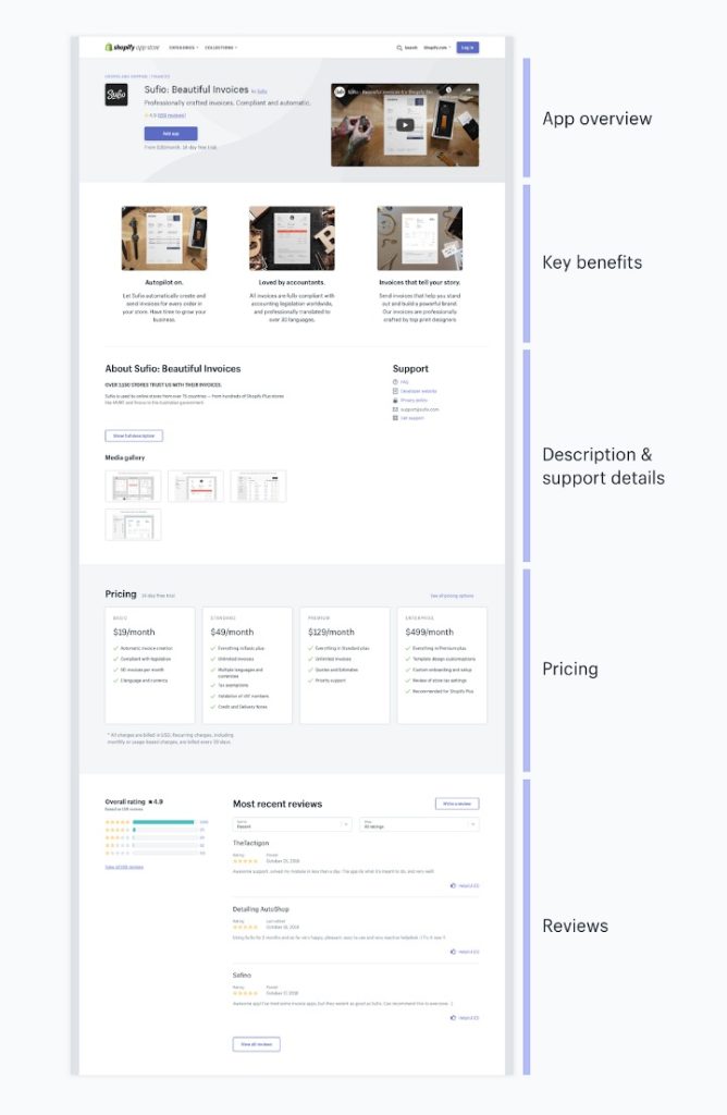
In addition to being more attractive than its predecessor, the new app listing model was designed to meet three key criteria:
- A content hierarchy that gave prominence to critical information
- Consistent content elements that allowed for easy identification of app features and comparison between apps
- A clean layout that eliminated long blocks of text and inconsistent formatting
Create flexible containers
Some developers provide beautiful images, promotional videos, and detailed pricing plan structures. Others are more minimalist, letting a simple app description speak for itself.
But what were the minimal information elements users need to decide whether an app was right for them? What additional elements would be nice to have? How many of these elements could be reasonably accommodated in an uncluttered and easy-to-read listing design?
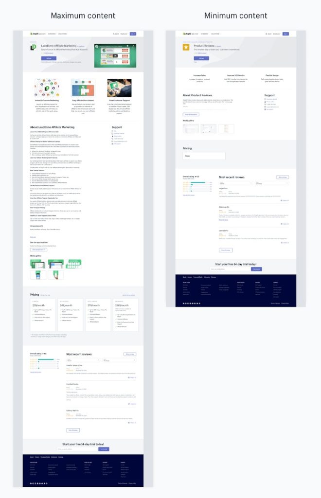
We conducted a series of merchant interviews to find out what information they considered most critical in choosing an app. Using these results, we built a list of must-have content elements which would become required fields in the form. Then, we made sure the listing design accounted for both the minimal and the maximally specified content and every combination of optional elements. Did the listing banner look too empty without a video? How about a listing that offers four pricing plans with dozens of options for each?
Sounds easy, but getting this right took dozens of back-and-forth iterations.
Use real content
The majority of apps have pricing models that are as simple as free or $9 per month. But we also had to account for, and clearly present, pricing that sounded like “$65/month or 3.95% of custom product sales, whichever is higher” or “Basic plan fee plus $1.50 per every 1,000 additional emails with a 14-day free trial.”
We couldn’t ask app developers to change their business models so our listings would look tidy, so we did a lot of research instead. We structured the submission form to account for almost every possible pricing situation. (For the edge cases, we asked developers to use the text field to describe their pricing options.) Then we defined some business logic to take all of that structured input and present it in the different contexts where users wanted to see pricing information. For example, in space-constrained contexts like the app card shown in search results, we show information about the free trial length if there was one, and if not, we show information about the lowest-priced plan.
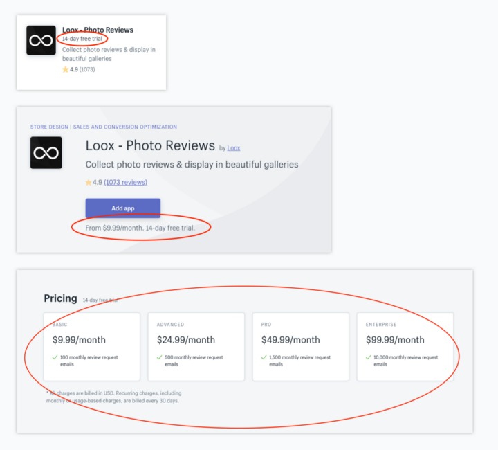
We had to do some fancy post-processing to accommodate some last-minute tweaks, but otherwise, this approach worked quite well.
Make it easy for users to submit required content
In the old Shopify App Store, descriptions were free-form blocks of text that could include links, testimonials, plan information, or anything else the developer wanted to include. Our new listing design structured information in an intentional way, with different sections for each content type. For example, to help users figure out quickly what an app could do for them, we asked developers to describe three key benefits of their apps so we could surface these at the top of the new listing page. A detailed description of app features lived in a separate, less prominent section of the listing.
But we were asking developers for something new. Most developers weren’t used to providing concise, user-centered benefits. To help them, we provided detailed guidance on information to include and examples of how to translate app features into merchant benefits. We also gave them clear visuals so they understood how these benefits would render in mobile and desktop contexts.
Our apps QA (Quality Assurance) team worked with many developers who still had questions about how to revise their app submissions to comply with the new information structure. Looking back, it would have been better to provide full-fledged examples of good app listings, rather than dos and don’ts. Now that the new Shopify App Store is live, we can refer to many exemplary listings, but it would have saved a lot of heartaches to have this kind of resource available sooner.
Gathering pre-launch feedback for an all-or-nothing launch
We follow the Agile methodology at Shopify, which means we release new features frequently, in little bits and pieces. This allows us to deliver value to our users quickly, and get feedback on changes as soon as possible so that we can iterate and improve for the next release. And we often roll out our new features to a small subset of users to spot any issues and limit the number of users impacted before we deliver a fix.
However, for several technical and logistical reasons, the new Shopify App Store had to go live all at once: the new listing design and content, using the new taxonomy that underlies the new navigation structure. There was no soft rollout to a beta group of users, and no gradual migration of apps to the new store. It all had to go live on day one.
This was a huge risk from a development and UX perspective. What if we had it all wrong? What if we met no one’s expectations? Our business owners rely on finding and installing apps to run their businesses, and our development partners rely on their apps being found and installed. People’s livelihoods were at stake.
We tried to mitigate this risk through continuous feedback and communication, finding creative ways to give our users and developers sneak peeks at our half-built solutions, and sharing our plans as we went. In addition to regular design, development, and content reviews, we ran 10 different formal feedback activities, collecting input from merchants, app developers, and internal teams. This helped us catch some UX issues early on and release them with confidence.
Still, the full experience of app discovery couldn’t be fully appreciated until we had the bulk of the app listings to choose from. Having this truer-to-life experience would have taught us a great deal about how well we met user expectations around sorting, ranking, filtering, and other key aspects of discoverability.
Building a complete taxonomy with partial visibility
A critical part of the redesigned Shopify App Store experience is the new taxonomy, which is a classification system that organizes apps into groups based on their core functionality.
Our goal was to provide users with:
- A clear pathway for browsing apps
- Efficient filters for narrowing down search results
- Useful app recommendations based on features users needed.
For all this to work, we needed a new classification system that could group all the apps into categories that were distinct enough to be helpful, but not so granular that they ended up containing only a handful of apps.
We wouldn’t know exactly how many or what type of apps we’d be launching with, but we couldn’t wait for the launch to build a classification system. We needed to classify apps with only a partial understanding of what the taxonomy would look like when we were done.
Flexible design through taxonomy
We knew we wouldn’t get it right the first time, and that the taxonomy would evolve as we learned more about the types of apps in our ecosystem. So we started with what we believed to be the most stable parts of the system: a set of high-level categories. We were relatively confident that for any given app its key feature, or the problem the app was designed to solve, would be described by one of these categories.
We defined a set of tags to capture the key features of an app, then grouped those app tags into subcategories. The tags are a stable property of the app — something that won’t change unless the whole app changes. However, the system is flexible since new subcategories can be created and tags can be reassigned to them. For example, as we tagged apps, if the tags in a given subcategory applied to a large number of apps, this would cause a subcategory to grow beyond a useful size. With the flexibility to reassign tags to new subcategories, we could balance the distribution of apps as we went.

We were fairly far along with this project before we formalized our approach to defining tags and subcategories. We’d developed some informal heuristics, but as our number of tags and subcategories doubled and then tripled, it became clear that we needed to define the principles used for decisions. We needed to be more explicit about things like the criteria we would require to create a new tag, or how many tags could be assigned to a single subcategory. We also needed to define a governance model that spelled out who was involved in these decisions and the process for implementing changes.
Having this sorted earlier would have avoided a few costly missteps and more than a few overlong discussions about whether a particular tag or subcategory was warranted.
Scalable design through taxonomy
New apps are being submitted all the time, some with new solutions we’ve never thought of. We can’t predict what great solutions our developers will come up with tomorrow. To solve this, we created a process for the Apps QA team to identify gaps and suggest new tags as they review incoming app submissions. The process also gives us a record of how the taxonomy developed, allowing us to easily revisit previous decisions if the need for a rejected tag grows over time.
We built this process so we could make the most of what different teams know about app functionality. Constructing the taxonomy required more than just input from the QA team though. We relied on effort and tooling from several teams, most of which were strapped for time and resources.

Tracking all the moving pieces to implement taxonomy changes was a continuous challenge. It often resulted in a sizable delay from suggestion to approval to implementation. Suggestions spent a lot of time in a state of limbo. While waiting for changes to be implemented, the Apps QA team had to continue working with an outdated taxonomy. This resulted in a tag debt that we’re still working to address.
We needed input from different teams to create the taxonomy, we also needed to keep the teams who could be affected by the taxonomy informed of our progress. Maintaining alignment across teams meant prioritizing transparent decision-making. When we were able to share what decisions were made and why our conversations became more constructive.
For our category and subcategory definitions, we wanted to make it easier for people to understand the concepts included in our taxonomy. The initial audience for the definitions was the team working to classify the apps. Subsequently, the definitions helped frame conversations about why an app should or shouldn’t be included in a particular category. We also used them while working with other teams to identify more concepts that should be included. After launch, we published a developer-facing doc introducing the taxonomy and offering definitions. Definitions were important for collecting and responding to developer feedback about app classification.
It took us too long to appreciate the value of team transparency. If this had been a priority earlier it would have helped us work collaboratively with more people. When we adjusted our approach, and created materials to support transparency, it became easier to align with and learn from all the people affected by the taxonomy.
Big project, big challenges
With a project of this size, it was inevitable that we’d underestimate — or completely fail to predict — some UX roadblocks until we ran right into them. By identifying the known UX challenges and formulating strategies for addressing them in advance, we managed to reduce a lot of the risks that could jeopardize the project’s success.
So far, the results have been promising: we’ve seen a significant increase in our install rates for both searching and browsing by category. This suggests that users are finding the apps they need more efficiently, and making informed decisions about whether to install them.
If you enjoyed this, you might also enjoy these post
How to Submit Bulk Images From Shopify to Google Indexing
