Product headline examples are the critical elements of keeping your visitors with you.
Since people do not want to waste time deciding to buy, product headline examples must be as descriptive as possible so that the visitors desire to see more.
Many brands follow some classical methods, but some inventions are also made to be different from others.
Creating a catchy product headline may sound easy with all pros and cons, but it is better to have some inspiration from these 12 captivating product headline examples from the brands.
contents:
- What is a Product Headline?
- The 12 Product Headline Examples
- How to Improve a Product Headline
- FAQ
- Conclusion
What is a Product Headline?
A product headline is a word used to describe the product’s advantages and attract the attention of visitors.
Product headlines help visitors understand the product’s reliability, quality, and functionality.
In a way, they can be considered as the titles and the subtitles of the product in the introduction and promotion.
The 12 Product Headline Examples
All brands apply different strategies when they create product headlines.
So, we have gathered the 12 product headline examples to see them and help you draw attention from your customers while creating yours.
1. NYX Cosmetics
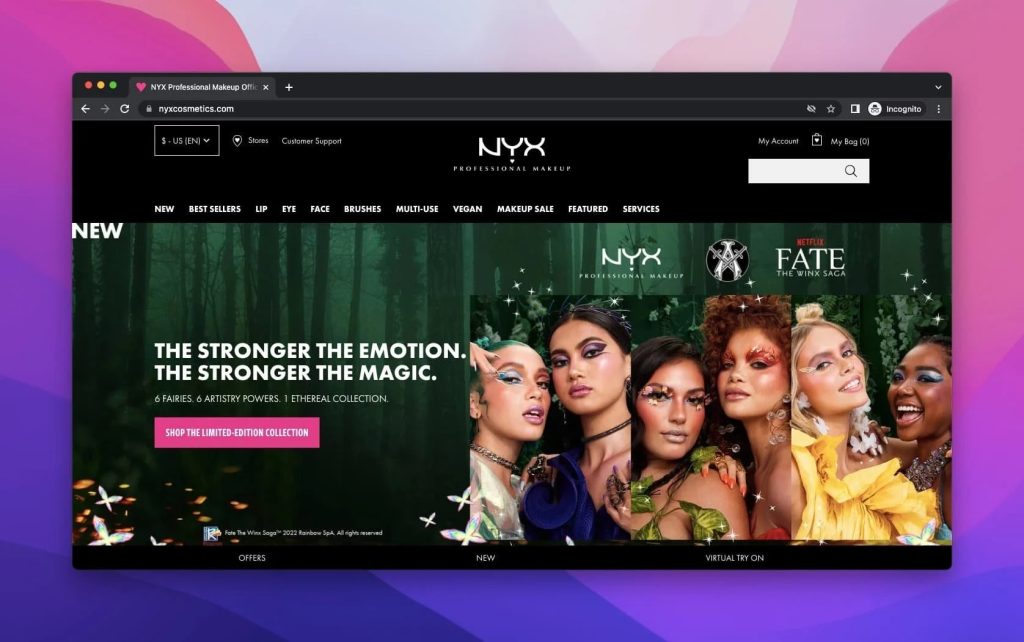
As a subsidiary of L’Oréal, NYX Cosmetics is a cosmetics company that produces in-demand makeup products.
NYX Cosmetics is a famous brand, and it constantly keeps improving itself with collaborations and new products.
In the product headline examples above, there is a collaboration between NYX and the Netflix show, Fate: The Winx Saga.
With a proper reference to the magical world of Winx, a general motto highly draws the attention of the customers.
Besides, the description under the title is reasonably sufficient to describe the newness that the brand wants to create and attract with it.
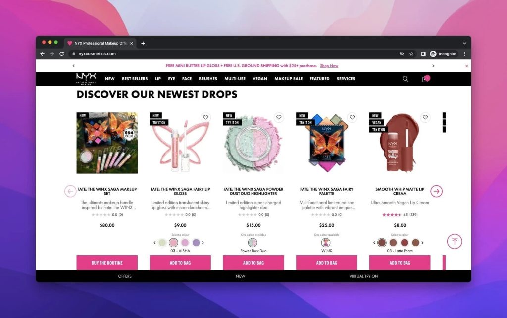
While the website displays the products with their names and images, the descriptions are to the point about the products.
Since some of the products’ descriptions are longer, it gives the visitors a sense of curiosity.
Under both product headlines, there are CTA buttons to make the customers keep buying and guide them through the buying process.
2. Revlon
Since 1910, Revlon has been a trend-tracking brand that has shown its development through the years and hosts different famous names as its models.
A cosmetic brand introducing products with different product headlines catches people’s attention since the routine is boring.
As for Revlon, the products are given different mottos based on their categories.
For example, concealers are promoted with “Awaken Up” since the aim is to conceal some unwanted details on the skin, which is given under the great title of the concealers.
Or, to emphasize the variety in new crayons’ colors, the brand presents a wordplay as “Wanna Play?”.
Revlon’s sharing the product with an extensive image is also influential because the colors and the impact it wants to have been evident.
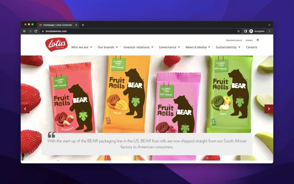
3. Lotus Bakeries
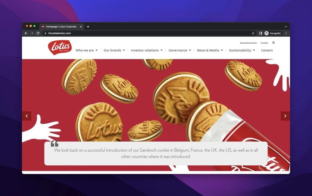
Lotus Bakeries is a Belgian company producing biscuits or biscuit-based products since 1932 and has a strong reputation among consumers.
When Lotus’s product headline is examined, the first thing that attracts is the intensity of biscuits as expected from the company and its aims.
The brand’s color, red, combined with biscuits and the details from the company.
In a way, the brand puts forward not the name but the descriptions to tell the story of the company.
Also, the brand points out the new products with a simple explanation without any name. Lotus may not put its name forward because this is its brand strategy.
People already know their names, and they highlight their improvement instead. Hence, they give a large portion of the image and overtake the name on the website.
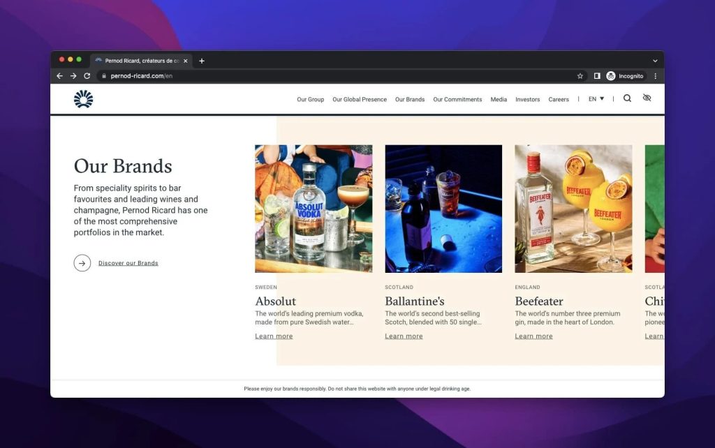
4. Pernod Ricard
Pernod Ricard is a French beverage company known for its anise-flavored spirits.
Products of Pernod Ricard are displayed in order with the title “Our Brands.” The brand shares its products with their names, images, and clear descriptions.
If you want to know more about them, you can get them by clicking “Learn More.”
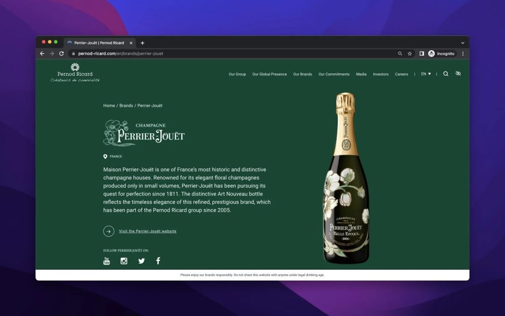
Pernod Ricard creates a product’s own page with more details, including their original location and date.
From this page, you are also referred to the specific product websites with a CTA addressing another website.
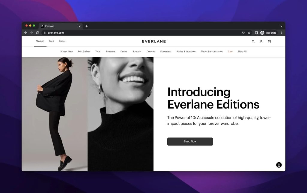
5. Everlane
Everlane is a clothing retail company with many headquarters with ethical principles and the aim of transparency.
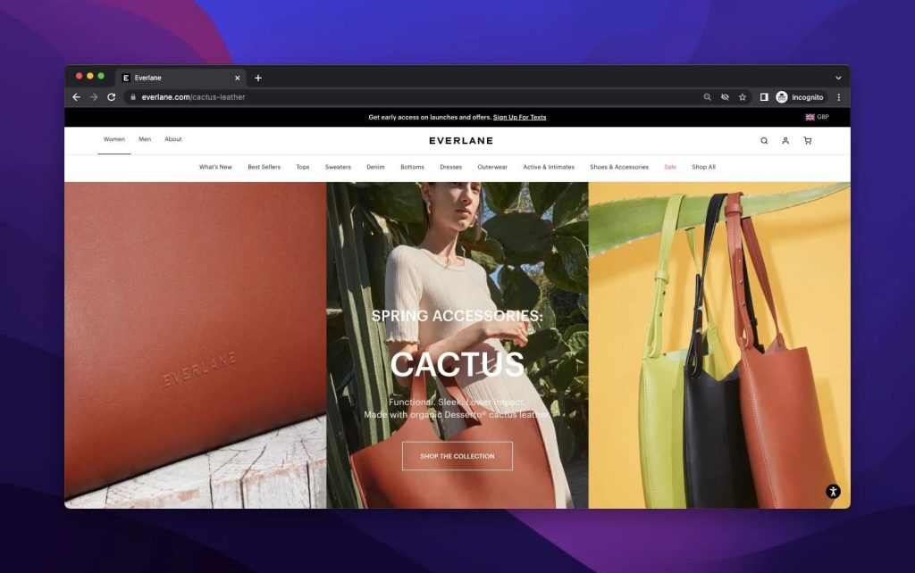
Everlane exhibits new editions and shares them with the customers on the above-the-fold homepage.
The brand is so to the point about what it wants because with the new introduction, and there is a charming image that aims to grab the attention of visitors to the new collection.
Also, the descriptions are relevant to the brand’s expectations for the company.
Therefore, we can conclude that Everlane has an assertive product headline.
To exemplify the products of Everlane, there is a spring side of the brand with Cactus.
This time, the brand chooses to present images as the background, and the information given is at the forefront.
Though the visibility of the product headline is open to discussion, it is undeniable that it is effective because of the usage of necessary details, like the name, explanation, and the CTA button, to go forward.
6. Apple
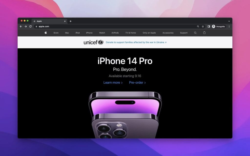
Apple is a multinational company that deals with different technological devices, and it is also famous for its consistency in producing new products for its customers.
Apple is a brand that makes a splash with each new product and creates pre-orders to show the limitedness and prestige of its products.
Because most people are familiar with the style of Apple, it describes the new product with a few words to make people wonder and crave more in a usual and wise way.
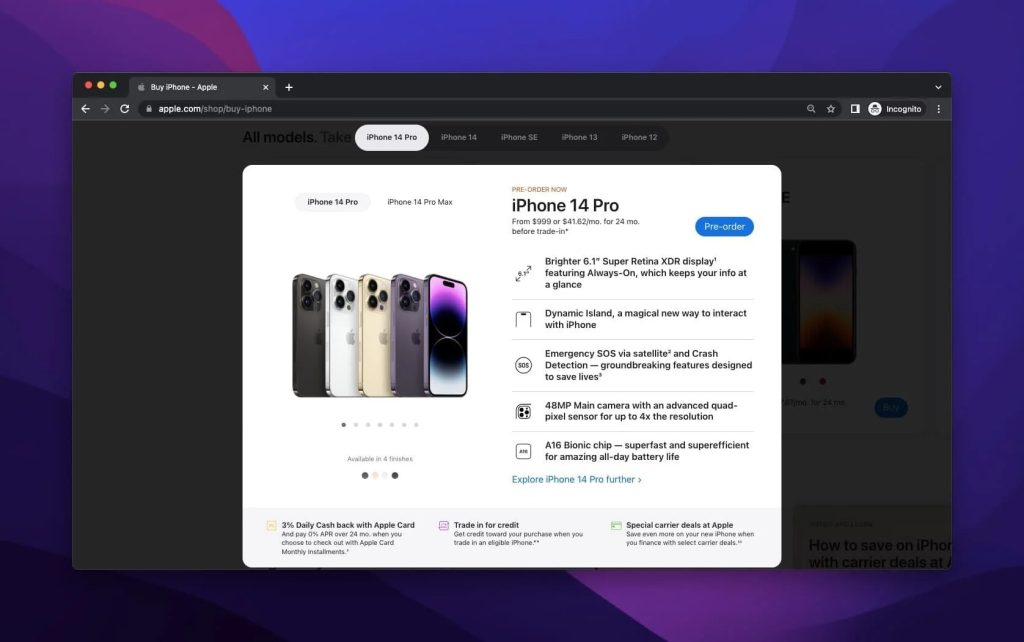
In this example of pre-order, Apple shows iPhone 14 Pro. With the options of colors and highlighting the sizes of the new phone, the new phone is put on display.
With the price, outstanding features, and paying methods, Apple presents a detailed product headline example.
7. Polaroid
Polaroid is a company producing films, cameras, and optical equipment for photographers.
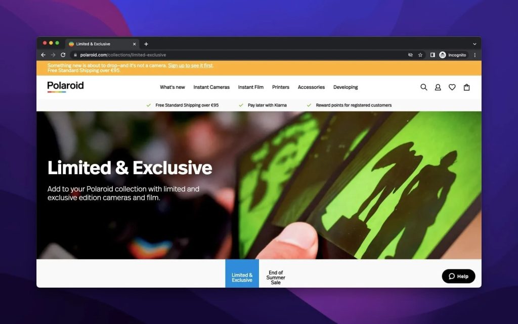
When examining Polaroid’s limited and exclusive page’s product headline example, there is an image of a hand-holding film to show the main point to the visitors. Also, the page has a title and descriptions.
This is totally ordinary up to that point. However, the difference between the other product headline examples is that Polaroid has no CTA here but only promotion of the product.
When scrolling through the page, there are items to purchase with the prices and the “Add to Cart” buttons.
Different from others, Polaroid directly addresses the ones who are interested in dealing with photography and considers people as they have already known about it all with different techniques.
8. Mucinex
Mucinex is a medication brand used to get rid of coughing and related issues in cases of cold and flu.
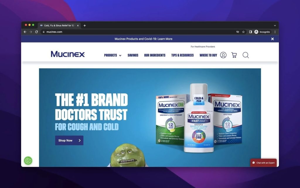
Mucinex’s product headline is dramatically different from bacteria and medicine examples.
They create a figure for themselves to tell that coughing and sneezing may be more irritating than you think.
Therefore, Mucinex is the correct medicine for recovery because the brand convinces that by sharing the doctors’ reviews.
The product headline frame is completed with the CTA button to direct customers to the products’ pages.
9. Dickinson’s
Dickinson’s is a skincare brand that works with well-known firms for more.
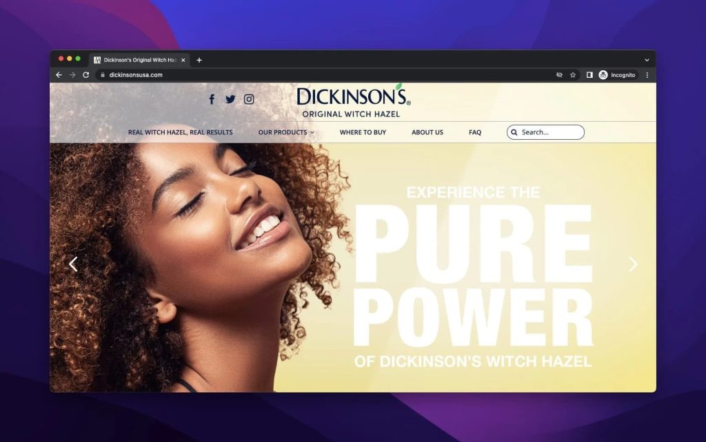
The above-the-fold welcomes the visitors with a large image and a great slogan of the pure solution, which is Dickinson’s one of primary aims
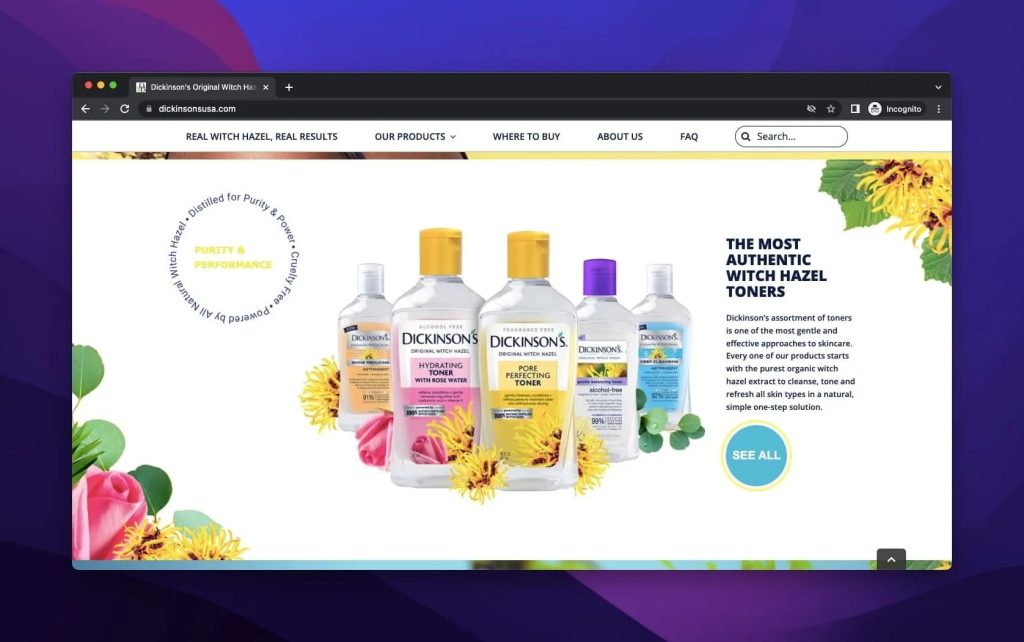
When the page continues, the toners produced with witch hazel stand out with a traditional description. For the ones who want to see more, there is a CTA as well.
On the left side of the products, there is an animated and interesting circle that highlights the features of the toner.
10. Lancome
Lancome is a cosmetics and perfume brand that is the partner company of L’Oréal.
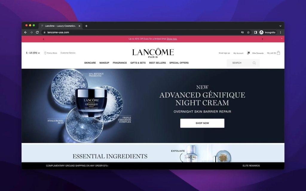
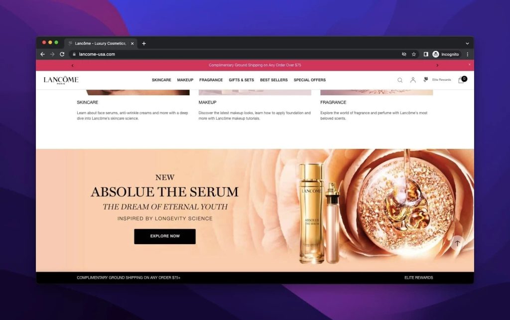
Similar to many brands, Lancome presents its latest and in-demand products on the above-the-fold with an elevated image.
The product headline’s size and intensity are one of the best examples on the list with the right CTA button.
Unlike the above-the-fold, the page ends with a shining product with a strong product headline.
The description with blazing words and the imagery of the product look interesting to give the impact of seeing more.
Considering the oppositeness between these two product headlines of Lancome, the appropriateness and their promotion is worth highlighting.
11. Nine West
Nine West is a famous fashion retailer. Though it was closed in 2018, the brand still buys its products from different retailers.
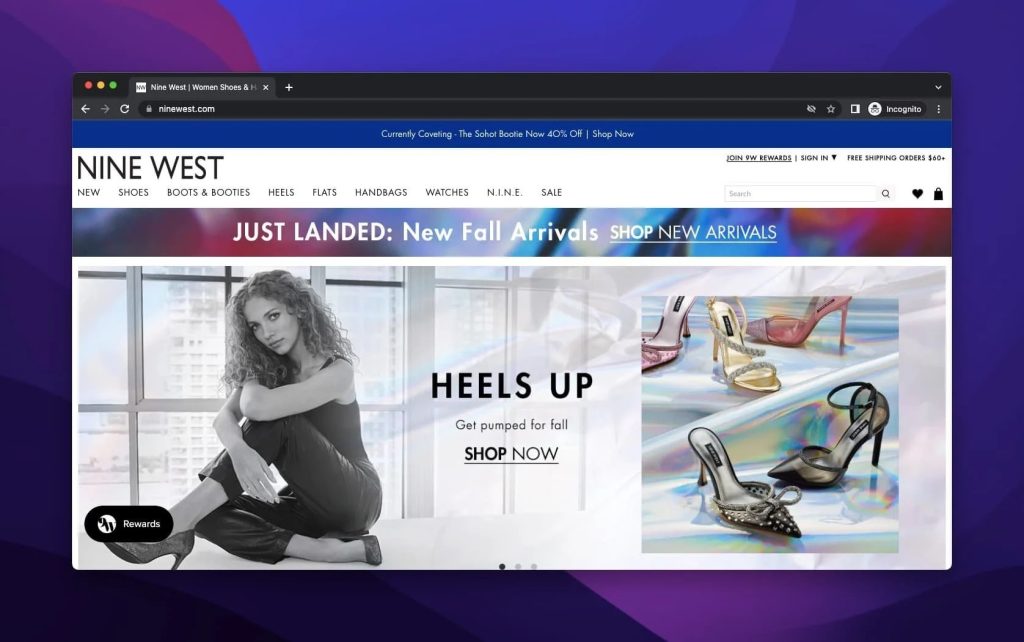
As for Nine West’s product headline examples, they are super chic and fascinating. The first example is given with a model wearing the new “Heels Up” series in terms of image.
The descriptions are direct and ornamented with its CTA.
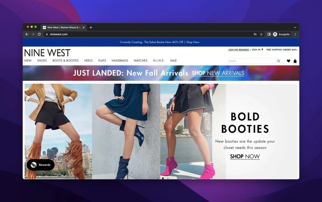
“Bold Booties” are put forward since the fall season is coming, and the focus turns to the boots.
Since Nine West’s favorite CTA is ‘Shop Now,’ this example is also shared with it properly.
Also, it is highly recommended to highlight the importance of seasonal campaign here since people and the brands follow it simultaneously.
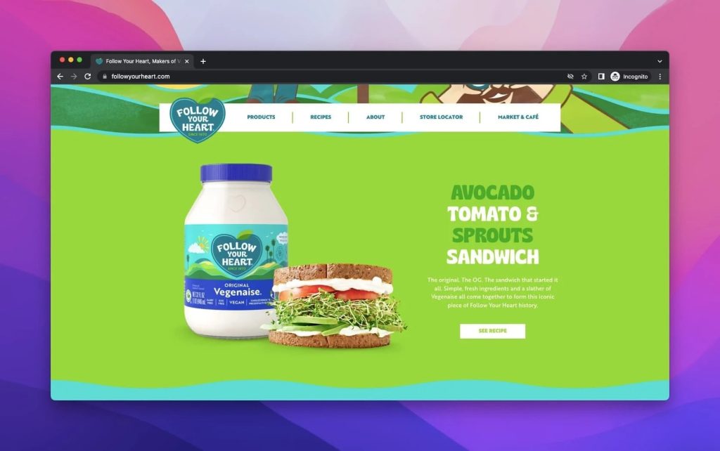
12. Follow Your Heart
Follow Your Heart is a vegan product brand that commits itself to sustainability and bettering the world by starting with nutrition and zero waste commitment.
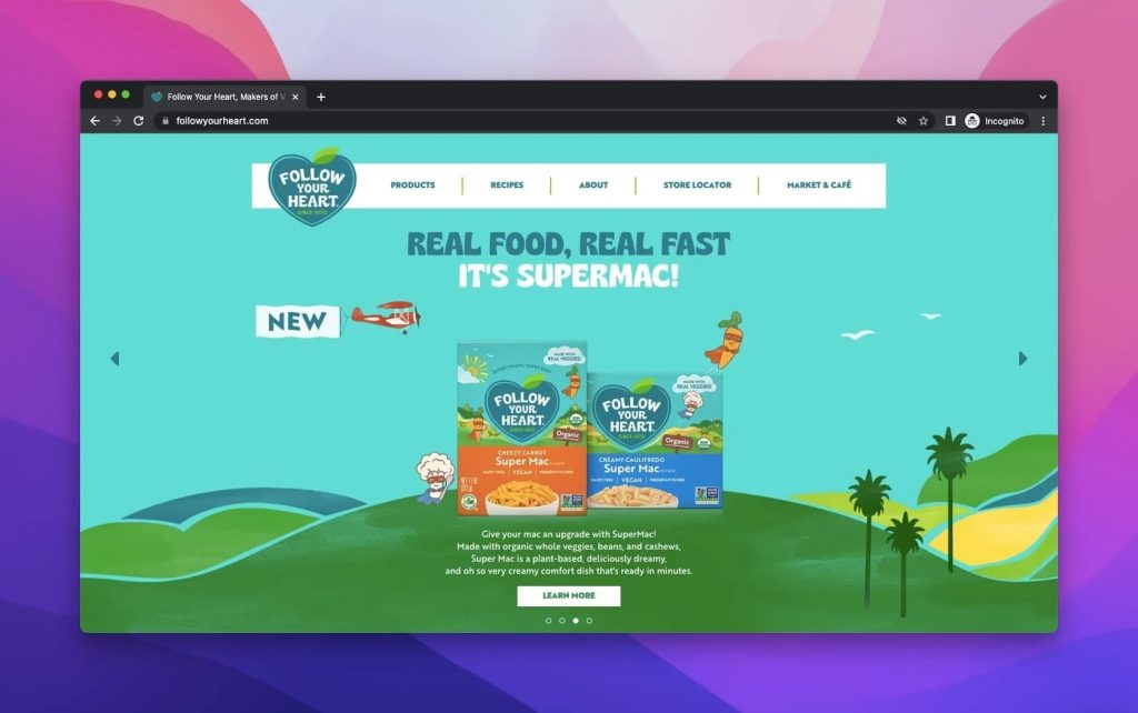
When we view the product headline of Follow Your Heart, it makes a promotion with an advanced form of its current product.
It starts with a motto as “Real Food, Real Fast. It’s Supermac!” After sharing the image of the product, there is an explanation of it.
The CTA is the essential component here, and it is possible to say that its location of it is pitch-perfect.
Furthermore, the brand has created a style for itself with animated figures and a world they hope to see, probably because the drawings are natural and green-oriented.
The product is shown with distinct features, like where it can be used and exemplified. Also, its CTA gives a recipe after a proper description.
How to Improve a Product Headline
There are some clues for improving a product headline.
- First, you need to know that you need to be different to capture attention.
- It is recommended that you know your target audience and what attracts them.
- Your words need to be magical because it’s your first introduction and exhibition.
- Also, you need to call them to act and take a further step to buy.
- Since there might be similar products to yours, highlighting your uniqueness matters.
- It is better if you do not create a too long or too short product headline part.
- Using social proof in product headlines is a choice of improvement.
FAQ
There are some frequently asked questions about product headline examples.
What Should a Product Headline Have?
All product headlines are visible with their great headlines or main titles. The second inevitable thing is a description that will help customers to know and discover more about the product.
Also, it should be persuasive and evocative to lead. Another thing to include is a CTA button. It is highly effective and recommended because it has a directive feature.
There is no need to mention the image, which gives the product’s visual details and attracts customers’ attention more than anything
How to Decide Catchy Words to Use in Product Headlines?
There are some categories to divide catchy words. First, you must know your audience and then decide on words to appeal to your customers.
For example, if they may have concerns about price, you need to highlight the cost-effectiveness of your product. Or, if the case is about functionality, show it.
Also, you may want to bring the material out; then, you need to talk about the materials.
On the other hand, you should not overlook your brand principles since it is one of the elements that contribute to you.
Conclusion
All in all, most of the product headlines may seem the same or similar. However, they are not since they are created by paying regard to brands’ essences.
What is vital in creating product headline examples, be striking and charming enough to persuade and give your point directly.
We believe that you will form better product headline examples for your brands by getting inspiration. So share yours and how you create with us in the comments section below!
If you enjoyed this, you might also enjoy these post
