Illustrations add visual clarity and reinforce the messages we send to our merchants. It’s a part of our brand’s identity and therefore needs to align with the goals and objectives of the company as a whole.
When our team decided to evolve our illustration style there were some key problems we knew we needed to address. Our style had been created at a time when we wanted the Shopify product to seem easy, lighthearted, and fun. We hoped that people would feel that starting a business wasn’t as monumental and serious a task as you might think, and we chose a style that reflected those feelings with lots of whimsy and delight.
Since then, our thinking has evolved. Instead of trying to create nice feelings, we needed to focus on what our merchants use our product for — starting a business. The new style would need to bring clarity, be direct and literal in its representation of information, and give merchants the confidence to trust us in their journey to create a successful business. Working with Shopify’s brand identity as our foundation, we set off to create the style we have today. Here’s how our journey unfolded.
Research and exploration
We dug into a lot of the old feedback we had from our last illustration update and got some main takeaways. Shopify’s presence felt too loud and intrusive, and it didn’t let the individual merchant’s brand breathe or have its own space. The illustrations were artistic and beautiful but the level of metaphor used could be more confusing than helpful. The overall feeling the illustrations gave was that the product lacked empathy and didn’t give our merchants a great amount of confidence.

We explored a lot of different styles, some very graphic and flat, others more reliant on line and detail. Most of this process took place during a number of sprints while working with other teams, and was influenced strongly by the new design language exploration happening at the same time. It definitely helped us to work alongside our product and content teams while designing the style. We were able to work off each other’s ideas and layouts, content, and illustration at the same time, which gave us a much more unified overall design than if we had created the style separately.
Once we felt we had landed in a good direction, we pushed forward exploring the style and defining where and how the illustration would be used within our product.
Refining the style
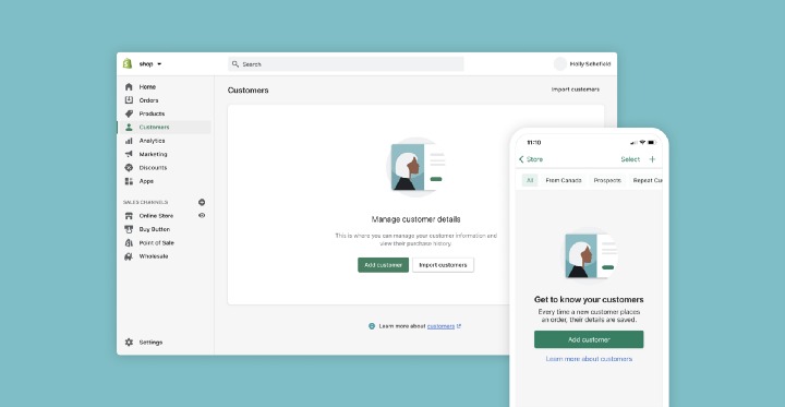
The process of refining a style is interesting. You land on something that feels right, but now have to build it out and expand it to fit all the needs of the product. This was definitely one of the longest parts of the process. We did a lot of our initial testing with Empty States (the empty spaces in the product when you first sign up and have no data yet) because it’s one of the most impactful areas (especially for new merchants) where illustration is used in the Shopify product. From there we defined all the areas and use cases for illustration and started exploring what those would look like.
Diversity and inclusion
We’ve been intentional with this style to try to represent who our merchants really are, with the diversity of race, age, gender, orientation, disability, and religion. The thing that has made the biggest difference from an illustration standpoint is using photo references. We have made it a rule that we don’t illustrate a person without finding a photo reference first. It’s easy to illustrate what we know (ourselves), but so important to get the people we don’t know right.
Photography or illustration?
An area we took into consideration when working with the brand team was when we use illustration vs. photography. Photography is a great tool when your goal is to inspire by showing tangible, real-world examples. Illustration, on the other hand, is better when you want to encourage individuality. For example, we don’t use photos of real people or shops, and try to limit being overly specific when representing products within our core product. We want to encourage people to be who they are, not who we put in front of them.
Color and depth
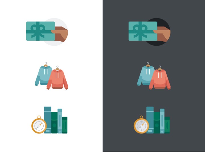
When it came to the color we knew the main thing was to move away from the overly dominating purple palette we had been working with. We needed something a bit more expansive where there wasn’t just one main pillar, but all the colors worked together. It was also important for the palette to work on both light and dark backgrounds. We used slightly muted tones to achieve this.
The expressiveness scale
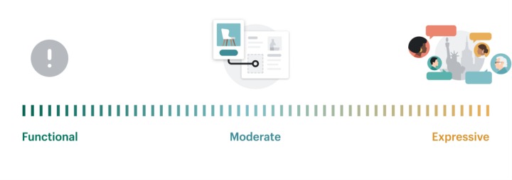
One of the biggest changes we made to our approach this time around was defining a scale for expressiveness. All of the illustrations we create are built off the same foundation, but they will differ in execution and function depending on where on the scale they fall.
Empty states, for example, fall in the moderate zone. These illustrations are going to be seen mostly by new merchants just starting their journey. They are more detailed and exciting but also restrained in metaphor and artistic expression. They fall somewhere between the stoic system icon and the artistic editorial piece that bookend the scale. A lot of our empty states include simplified versions of our UI to help pull back the curtain for new users so they have a better understanding of what they’ll see on a page in the future.
Our error states sit firmly on the functional side of the scale, with a simplified and very direct icon. There’s no room for confusion on these pages. We also don’t want to add too much personality that could be taken as insensitive at a stressful moment (ie: no connection cat).
Editorial illustrations on the other hand are meant to have lots of personalities and be more of a focal point than most of our other illustration categories. We use editorial illustrations sparingly and in specific use cases, such as blogs or marketing.
We also put color usage on this scale. Our functional system icons through to our moderate empty states use a more limited and restrained color palette, whereas our home card announcement and editorial illustrations fall to the more expressive side of the scale, and so tend to use our brighter, bolder colors.
Implementation
We broke down every illustration into a list with its location, content, and current sizing. We also gave each illustration an impact rating from low to high — this way we were able to see what we needed to work on first and what we could possibly just remove.
It was also at this point that we realized we needed some additional help to make the switch happen. We worked with the fabulous illustrators at Canopy to complete this process and we couldn’t have done it without them.
Results
We can confidently say our new style fulfills the goals we set out hoping to reach. It’s brought clarity, delivers information directly and literally, and should give merchants the confidence to trust us in their journey to create and operate their businesses. As we continue working in this new style, it will continue to evolve and grow, and our hope is that it will be something we can build off of for a long time.
We also couldn’t have done this without the help of many of our Shopify team members. Alex Page, Kyle Durand, and Emma Orhun helped us with the implementation and development work, and Alistair Lane and Jesse Bennett-Chamberlain were tireless in their commitment to feedback, reviews, and helping push this project forward.
If you enjoyed this post, I’d be very grateful if you’d help it spread by emailing it to a friend, or sharing it on Twitter or Facebook. Thank you!
