A very common question I get a lot from clients is “how do I know what Shopify theme is best for me?” or “what Shopify theme should I choose?”. There are all sorts of factors that go into deciding on a theme but in this article, I will try and focus on 5 key things to consider when picking out your Shopify theme.
Choose The Perfect Shopify Theme For Your Store
1. Understand Shopify’s Limitations
Shopify has a ton of great features and there is an endless list of benefits of using the Shopify platform but like anything, it’s not perfect and still has some limitations that many people might not know or overlook. From my experience no Shopify theme gets you 100% of the way there, a lot of people come in with the expectations that they just will find a theme and it will do everything they want and unfortunately that isn’t normally the case.
When looking for a theme look for one that gets you 80% of the way there and then the last 20% you can deal with in phase two of the build or if it’s urgent hire a developer to finish off the last few customizations. Another important thing to know about Shopify (that many people seem to not know) is you can’t just customize every page however you like. A Shopify theme is set up with “sections”, these are drag-and-drop elements that you can use to design your store and it’s very simple to use but you are limited to the capabilities of the sections. You can’t just drag and drop images and products wherever you please. Check out this quick video of what the template builder looks like.
You can see on the left there are sections to choose from like video, slideshow, etc and you can move them around to change the order. You can also open up the sections to see what kind of content you can add and how you can organize the content. Lastly, when designing a Shopify store with sections you must understand most Shopify themes only allow you to use sections on the homepage, product page, and collection page. This means you can’t use the sections you designed your homepage with on every page of the store, any other page you create on Shopify like an about us will be made with the static page builder that looks like this.
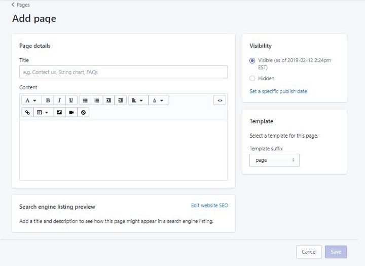
You can still add images, videos, and text but just not in the same way as if you were using sections. One thing to note is some themes do come with the capability to add sections to a page that isn’t the homepage, collection page, or product page but this requires some custom work.
2. Stay Within The Shopify Theme Store
Now that you know the limitations of Shopify it’s time to start looking for a theme for your store. I highly suggest choosing a theme within the Shopify Theme Store. Shopify carefully evaluates all the themes submitted to the store for quality and functionality before they are listed. Also, they make sure that all the themes listed in the theme store comply with the updated policies of Shopify, so if you purchase a theme from the store you know it complies with all the rules and regulations.
Another important thing when selecting a Shopify theme is knowing you get great support. Any theme you select in the Shopify store will all have its own support you can reach out to if you have any issues with the theme or just general questions about it. Not every theme developer has the same type of support so I suggest if you are interested in a theme reach out to the theme developer with a question and see how long it takes them to reply. You can usually find the name of the theme developer here
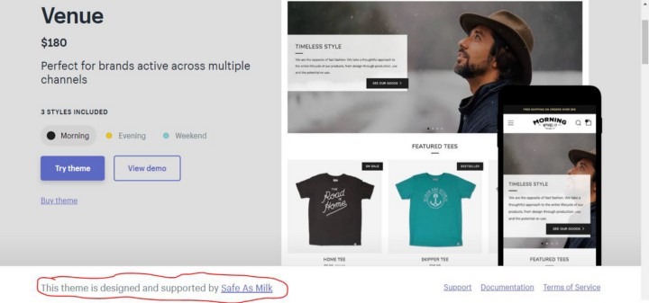
Some theme developers I’ve worked with that have great support are Archetype themes, Out Of The Sandbox, Pixel Union and Group thought.
From personal preference, I would avoid working with free themes simply because they lack a bunch of functionality that many paid themes have and the support isn’t as good. Free themes are great to do some testing on but I’d recommend not trying to build your brand/store on them for the long run, like always you get what you pay for and with a paid theme you get a lot more.
3. Don’t Pick A Theme Just Because It Matches What You Sell
A common error lots of people make is they see a theme preview that is mocked up to sell what they are selling and they think that makes it a great theme for them to choose. In some situations, this might be the case, but in many situations it’s not and the theme they think is a good fit for them is likely missing some functionality they were looking for. When looking at theme previews try not to focus on the products the demo is selling, focus on things like the layout, the types of content being shown, how easy the site is to navigate, etc. For example, some themes require really big imagery to look good, and if you picked a theme because the demo showed they sell clothes (and you sell clothes) but didn’t really pay attention to the layout and you have all small images the theme probably won’t look good once you start to make your site on it.
4. Make A List Of The Main Features You Want And Test The Themes To See If They Have This Functionality.
Once you start going through some themes and learn the types of features they can offer make a list of the main features you like about certain themes. Once you have a list of features you want on your store (ie video, Instagram integration, cart drawer, etc) go look for a theme that has most of those features and also fits well with your brand. You want your theme to have most of the main features you are looking for so you can cut down on development costs in the future. If you see a theme with one feature you really like but doesn’t have 5 other features you want DON’T go with it. Instead, go with the theme that has more of the features you wanted and then have a developer add the feature it is missing. When looking for the features of a theme the main ones are listed right under the theme preview page.
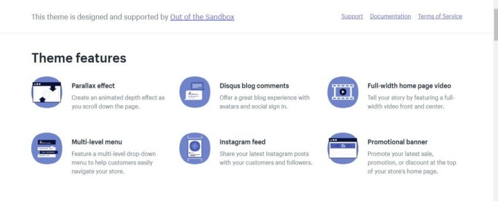
Lots of times these aren’t all the features a theme provides. This is why you want to make sure you go into the demo preview and play around with the theme a lot.
I’d suggest setting up a Shopify partner account and creating a development store. When you have a Shopify partners account you can create a development store and then test out any theme from the theme store for free. You can’t edit the code from the theme but you can see all the sections it has and most of the possible customization.
5. Make Sure The Theme Is Mobile Friendly And Conversion Optimized
A common mistake many people make when picking out a theme is not paying a whole lot of attention to the mobile view of the theme. The desktop view of the theme is important but if you think about website traffic most of it is coming from mobile so when picking a theme make sure you look into the mobile experience. You want to make sure the mobile experience is easy to navigate and easy to make a purchase on.
Another thing when looking at themes is you want to make sure they are optimized for conversions, in theory, you would think all of the stores are optimized for conversions but some do a better job than others. No theme will have all the best practices for conversion optimization implemented but some themes implement more than others so you want to keep an eye out for them. For example, you want to make sure a customer can easily add the product to their cart, sounds simple but some themes are way better optimized for this than others. Take a look at this example
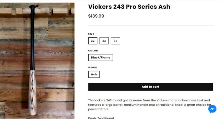
In the desktop view, you can see the entire product image, product name, price, variants, and add to cart button all without having to scroll, this makes it very easy for the buyer to hit add to cart. You want to look for the same sort of setup on mobile. When viewing a product you want the add to cart button to be displayed with very little scrolling involved, by having less scrolling to get to your add to cart button leads to more buyers adding the product to their cart. Here is an example of a mobile product page that isn’t optimized well.
If you enjoyed this post, I’d be very grateful if you’d help it spread by emailing it to a friend or sharing it on Twitter or Facebook. Thank you!
you might also enjoy these posts
